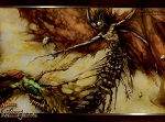
Alrighty everyone, i am ALMOST finished with my hydralisk pic.
after a whole mess of editing, redoing several areas, shading, re texturing, and hours of blood, sweat, and tears, its in the final stages of being complete
just a couple of things i would like feed back on before im comfortable with makeing the final touches.
1. The claws:
on both sides, you can see that the claws are different from each other. on the left side, the claws are larger, and extend right up to the top of the arm. on the right side, theres a bit of muscle that stretches out from the arm, and then the claws begin to extend out from that muscle, being thinner than the other side.
which set of claws looks better?
2. saturation/contrast/brightness:
should i make the shadows darker/highlight the lighting? im thinking about altering the brightness/contrast so that the plating glows with a shiny yellow in the lighted areas, and the shadows would become much deeper.
3. everything in general:
does the picture look appealing? is there anything in particular that draws the eye from the rest of the image? does anything look odd?
any and all feed back is welcomed, would like to hear all of your opinions.
some things to note: not all of the shading is finished, i still have to make a shadow being casted by the head onto the body. im still going to add things such as spikes on the back, plating, grooves in the arms, and im going to make everything look straighter/neater (namely those plates that extend downward from the chest).
if for any reason you cant veiw the image, tell me
Critiques, I SUMMON THEE!!
-
Dtox
- Terran SCV Lube Technician

- Posts: 75
- Joined: Sat Aug 28, 2010 1:54 pm
Critiques, I SUMMON THEE!!
You do not have the required permissions to view the files attached to this post.
herpin mah derp like yeah
-
Krazy

- Zerg Creep Colony Landscaper

- Posts: 446
- Joined: Sun Nov 30, 2008 1:49 am
Re: Critiques, I SUMMON THEE!!
Is there anything you can do to the background?
The left (from its pov/our right) claw make me think its name is "Vlad the Hydralisk." Usually they seem to hold their claws closer to their body. To that respect, I think the right (our left) claws look better.
The face looks much more detailed than the rest of it for some reason, especially on a zoom up.
The tail looks weird, mostly because of the way you're sort of cutting the bottom of it off.
This is great though, by the way, if you didn't specifically ask for critique I would just be like "wow you have way more talent at art than I do."
-
Dtox
- Terran SCV Lube Technician
- Posts: 75
- Joined: Sat Aug 28, 2010 1:54 pm
Re: Critiques, I SUMMON THEE!!
thanks for the critiqueKrazy wrote:Is there anything you can do to the background?
The left (from its pov/our right) claw make me think its name is "Vlad the Hydralisk." Usually they seem to hold their claws closer to their body. To that respect, I think the right (our left) claws look better.
The face looks much more detailed than the rest of it for some reason, especially on a zoom up.
The tail looks weird, mostly because of the way you're sort of cutting the bottom of it off.
This is great though, by the way, if you didn't specifically ask for critique I would just be like "wow you have way more talent at art than I do."
the tail is going to be more filled out because the original image had it being cut off, i increased the canvas size so there would be more room.
the head is what i basically finished first, so it would be the most complete XD
thanks again though, i was definitely leaning towards the bigger claws.
EDIT: im also gonna add a darker backround, not sure exactly what color but im working on it.
herpin mah derp like yeah
-
Lavarinth
- Xel'naga Administrator

- Posts: 6540
- Joined: Wed Aug 16, 2006 5:21 pm
- Location: His Ashworld Planet
Re: Critiques, I SUMMON THEE!!
Color wise this is progressive, however I can't comment much as the coloring is not complete. I assume this is a base color with the intention of adding shadows, detail, etc?
- - Lavarinth
Campaign Creations Administrator
Campaign Creations Administrator
-
Dtox
- Terran SCV Lube Technician
- Posts: 75
- Joined: Sat Aug 28, 2010 1:54 pm
Re: Critiques, I SUMMON THEE!!
yes and no.Lavarinth wrote:Color wise this is progressive, however I can't comment much as the coloring is not complete. I assume this is a base color with the intention of adding shadows, detail, etc?
as you can see the shading is largely complete, but more will be added.
im also going to alter the contrast/brightness to saturate the shadows and lighting a bit more.
this picture here is a little bit old, i have a much more updated version with a ton more detail in the chest area.
herpin mah derp like yeah
-
Thalraxal
- Protoss Stargate Concierge

- Posts: 1212
- Joined: Sun Aug 12, 2007 12:42 pm
- Location: Ontario, Canada
Re: Critiques, I SUMMON THEE!!
I rather like the muscle texture you've given the Hydralisk. I think it'll turn out pretty neat. The teeth stand out a little bit more than they should, but I think that has more to do with the fact it's only half-textured than actually being a problem. You might want to consider making them a little bit more yellowed though.
I think the triple claws are kinda silly looking, but that's more of a complaint directed at Blizzard's designers than you.
I think the triple claws are kinda silly looking, but that's more of a complaint directed at Blizzard's designers than you.